Account maken
Inloggen
Vrienden van 3dhype:
Travellight
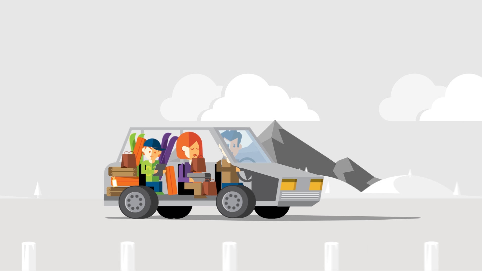
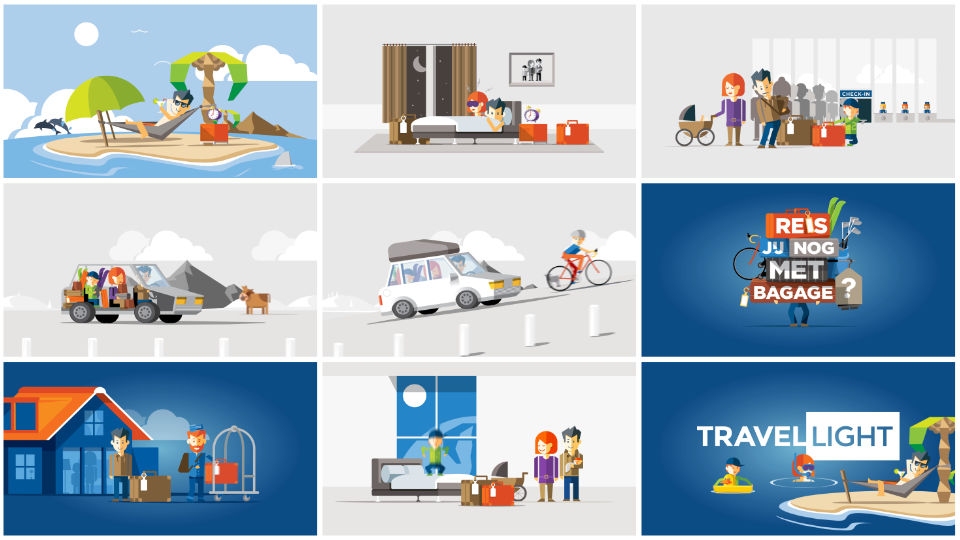
We worked with ad agency Epidemie on this one. High five for Michel de Wit acting as the illustrator on this project. We usually illustrate ourselves so it gave us more time than usual to focus on the animation. Almost every part is rigged and bouncy mirroring the bubbly fun feeling of not being dragged down by excess suitcases.The 2.5D animation style, which is actually done in 3d, gave us the opportunity to make funky transitions and more flexibility with the rigging. We go smoothly from scene to scene so that it does not feel that we interrupt the journey akin to the product. We love to make those metaphors to really embed the concept on all levels. Even with something as mundane as a transition.
3 jaar geleden geplaatst 2022. 0 Likes 1871 Views Reacties
